Branding · iON Creative Studios
Casa Marin
Flavors of Mexico — from our Casa to yours
01
Introduction
Casa Marin is a vibrant, family-owned restaurant in Arizona preparing to launch its own tequila brand. I partnered with the lead designer to develop a logo and product mockups that helped the client visualize their brand prior to launch.
The resulting identity blends bold, earthy visuals with a premium yet approachable feel, reflecting the culture, flavors, and natural beauty of the Southwest. Casa Marin aims to offer a modern dining and tasting experience rooted in tradition.
02
Problem
Casa Marin wanted to expand beyond the restaurant and enter the spirits market with a tequila that stood out. They needed a new logo and brand direction that captured the uniqueness of their flavors while feeling authentic and memorable.
03
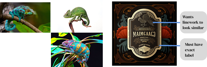
Phase 1 — First Concepts
The client shared early concepts and animal inspirations they were drawn to. I initially explored a chameleon, using its ability to change color as a metaphor for the variety and complexity of the tequila's flavor profiles.
I developed custom vector linework with varying stroke weights to create fluid, dynamic movement throughout the mark. Alongside the logo, I presented a branding card outlining typography and color palettes to establish a cohesive visual system.
04
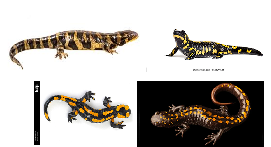
Phase 2 — Refinement
After the first presentation, the client felt the chameleon concept was too obvious, though they responded positively to the typography and supporting visual elements. We revisited the concept together and landed on a salamander — an animal that also changes color but felt more distinctive and aligned with their vision.
We brainstormed mascot silhouettes collaboratively, and I refined the linework to maintain the same sense of motion and energy. The final deliverables included a full brand mockup and production-ready assets for packaging and merchandise.
05
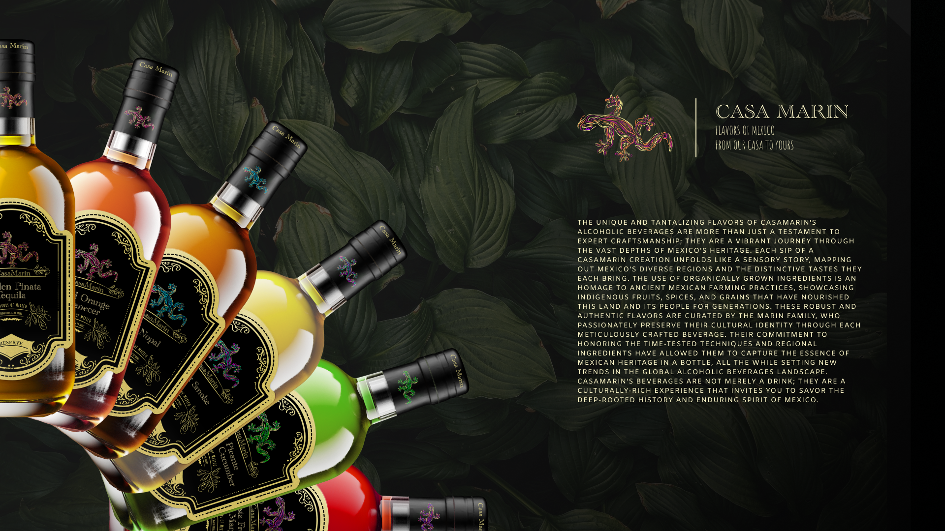
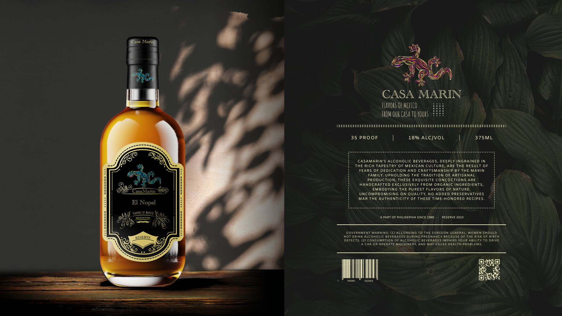
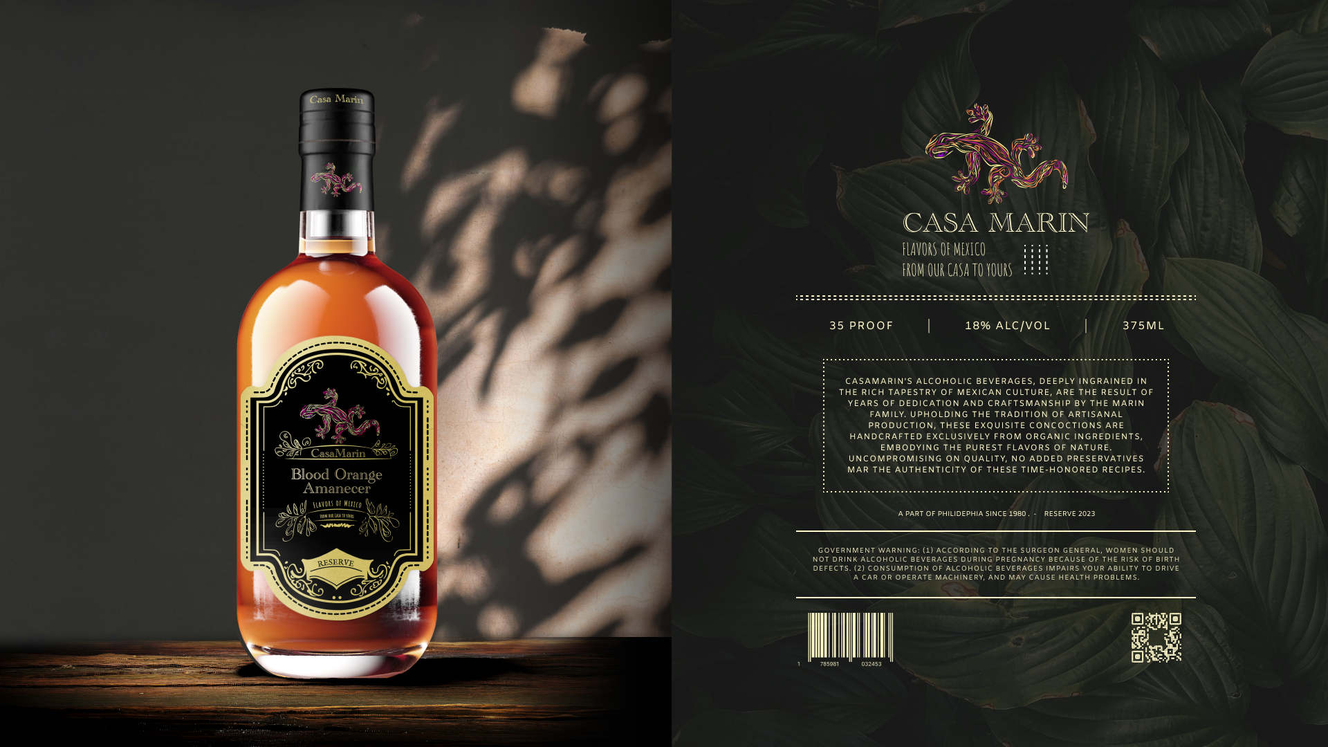
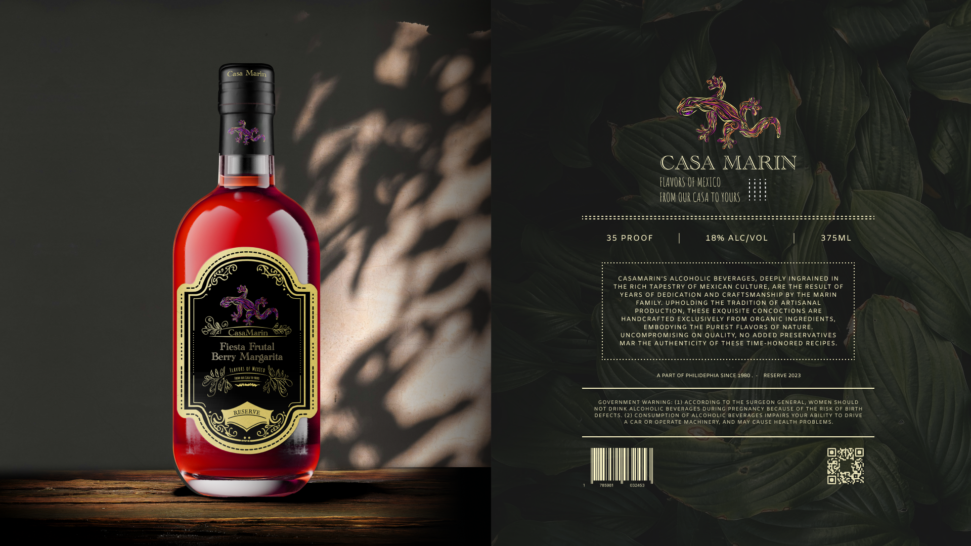
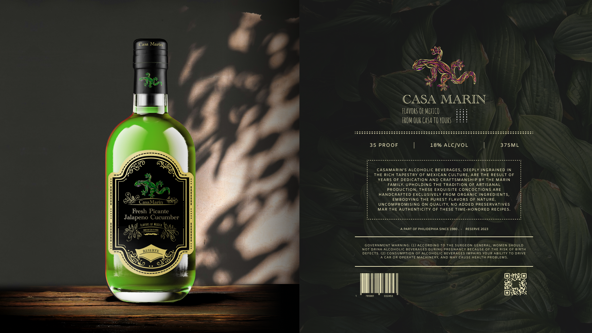
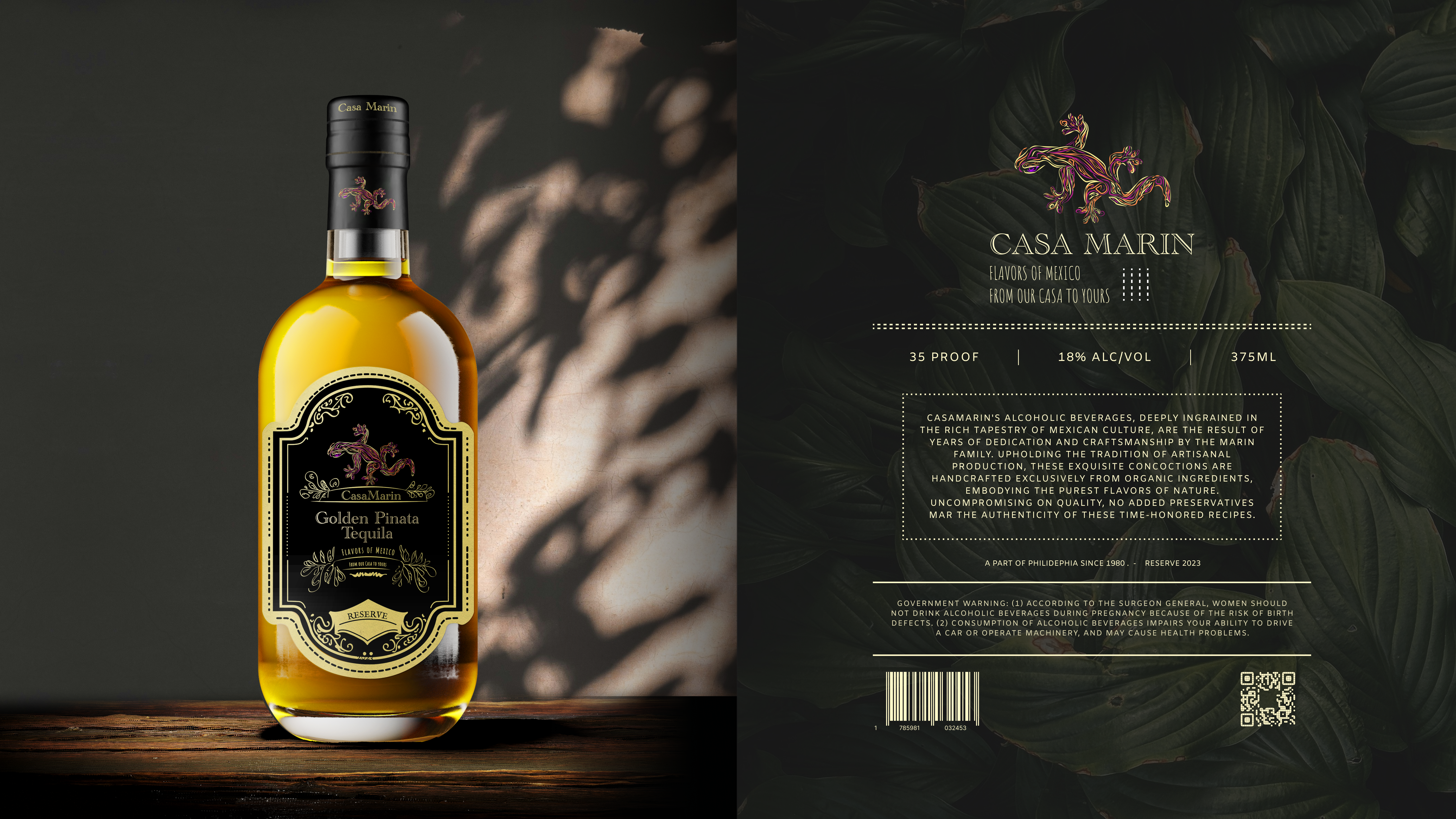
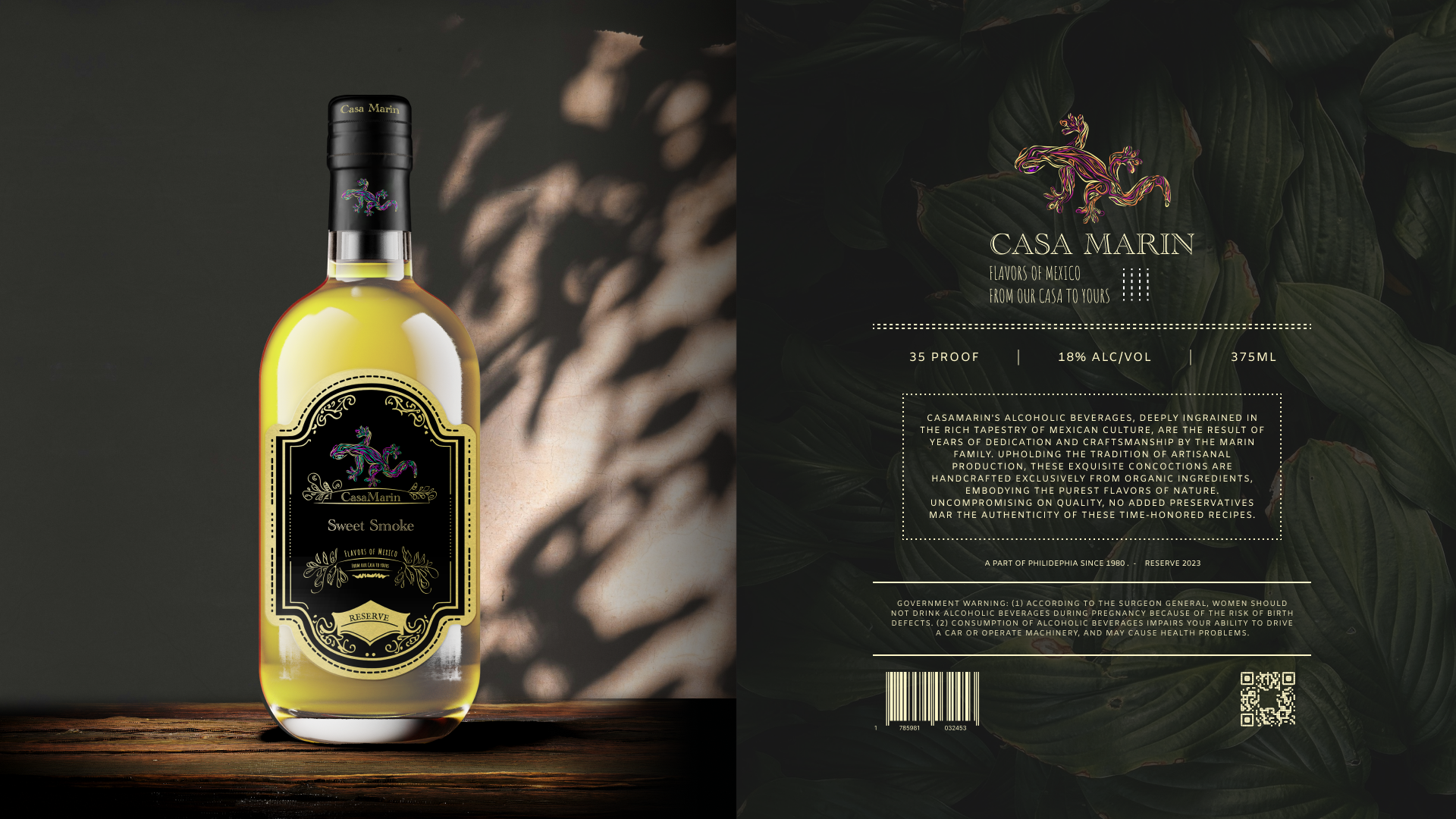
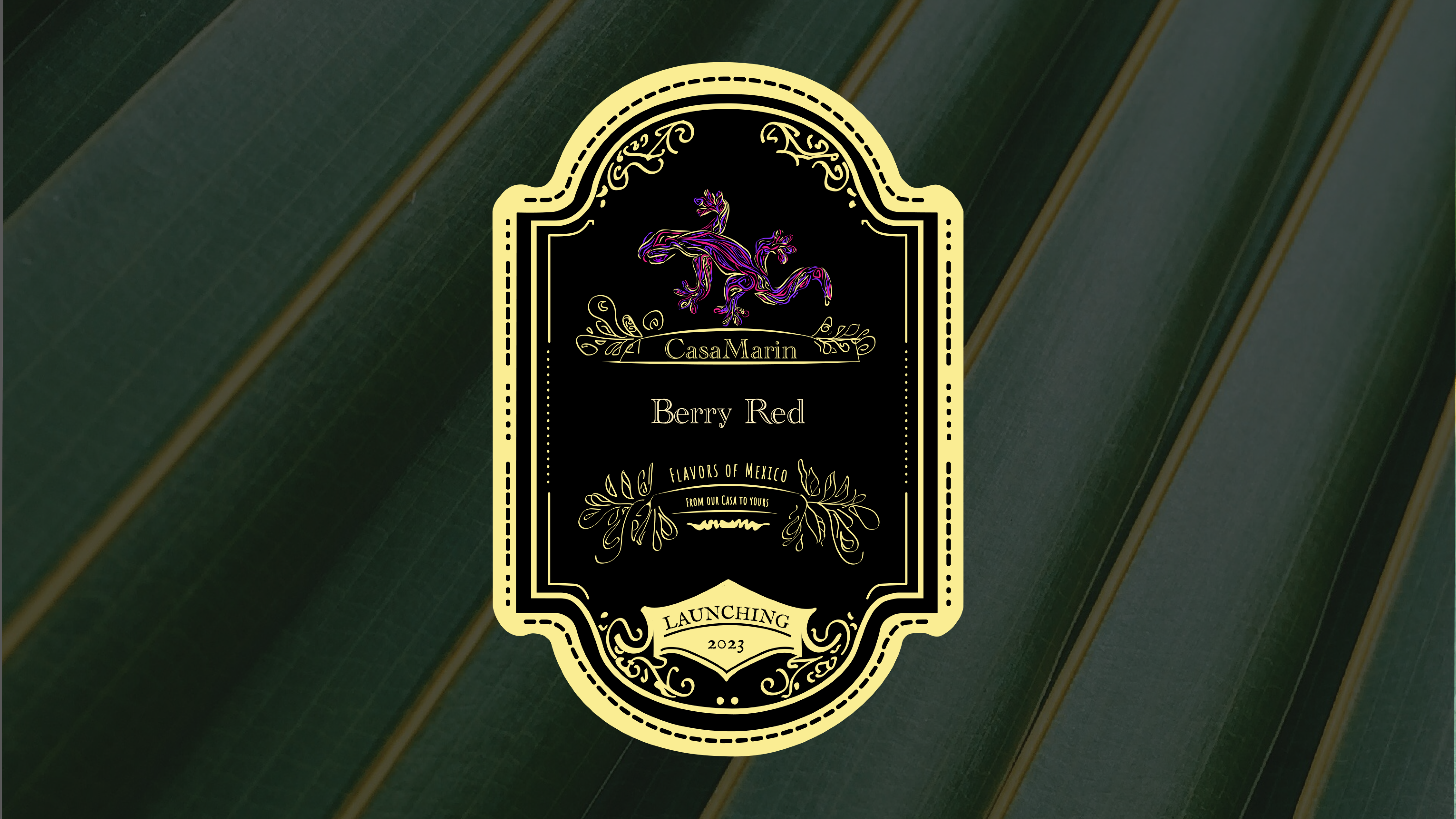
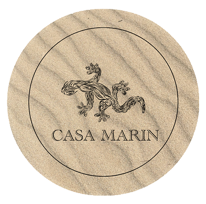
Final Branding System
The final identity centers on a salamander mark rendered in precise linework, paired with a premium label system in deep black, gold, and vibrant accent colors. The typography pairs Academy Engraved LET for display with Amiko for supporting text.
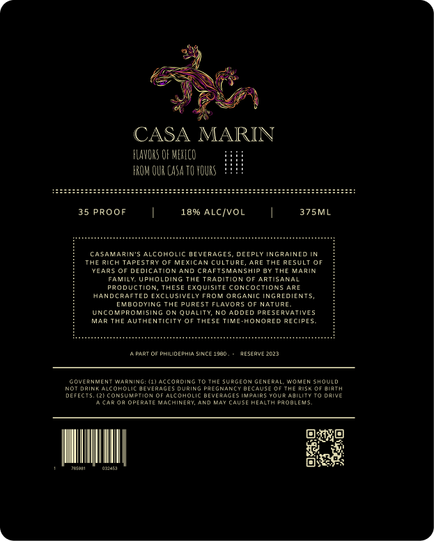
Final salamander label · Back label
Brand Mark
Colors
Typography
Display
CASA MARIN
Academy Engraved LET
Body
Flavors of Mexico
Amiko
06
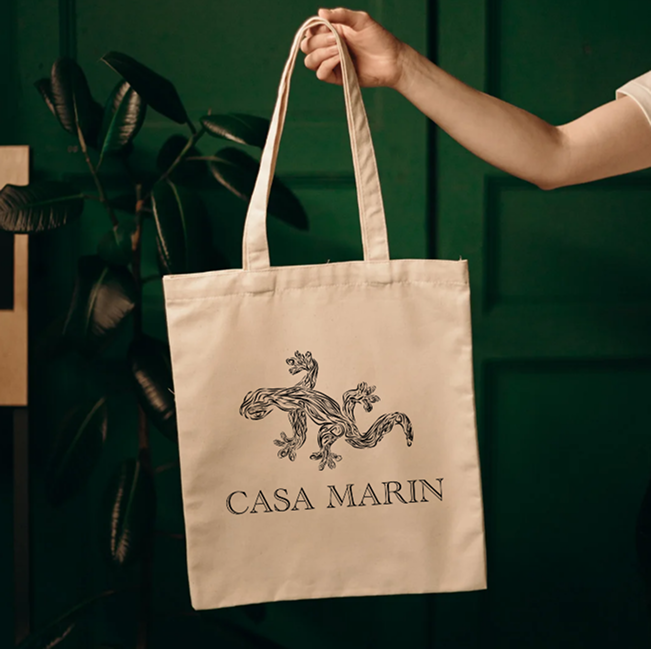
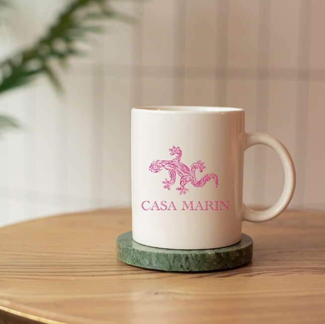
Merchandise
The brand identity extended into merchandise applications — tote bags, mugs, and branded goods that carry the salamander mark into everyday touchpoints.
07
Final Presentation
The final deliverables included production-ready bottle label assets across the full flavor range, each featuring the salamander mark with color-coded accents to differentiate varieties. The dark, botanical aesthetic positions Casa Marin as a premium yet expressive brand in the spirits market.