Case Study · Visual Design · UX · Branding · iON Creative Studios
GEC Communities II
A full rebrand and website redesign for a carbon credit company on a mission to reduce the world's carbon footprint by preserving the rainforest — making a complex subject accessible, credible, and navigable.
01
The Client
GEC Communities II Inc. is a carbon credit company with a mission to reduce the world's carbon footprint by preserving the rainforest. They monetize R.E.D.D. (Reduced Emissions from Deforestation and Forest Degradation) carbon credits generated from protecting the rainforest — while simultaneously improving the quality of life of the indigenous populations living in those regions.
Their work sits at the intersection of environmental impact and social responsibility: the money from carbon credits funds infrastructure projects like housing, schools, hospitals, and sustainable farming in the communities that depend on the forest they protect.
02
Phase 1 — Social Media Covers & Pitch Decks
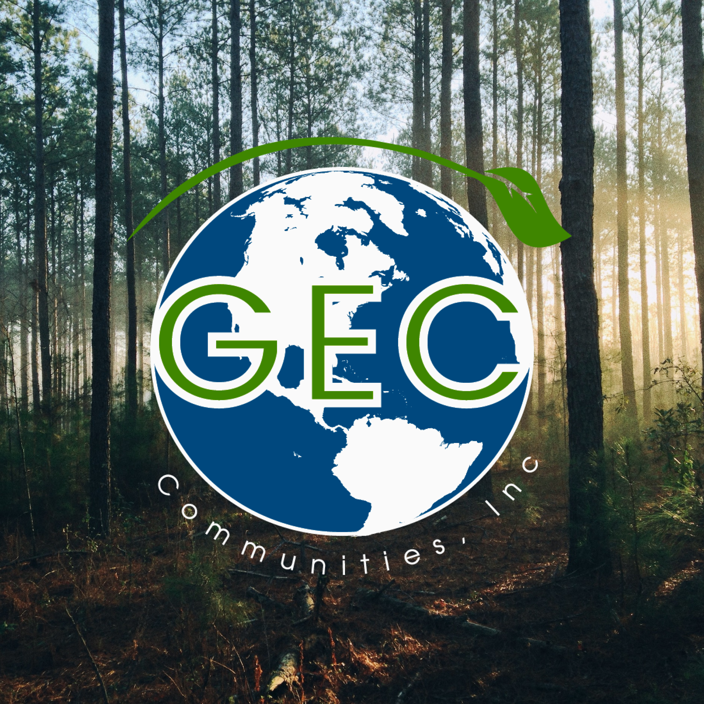
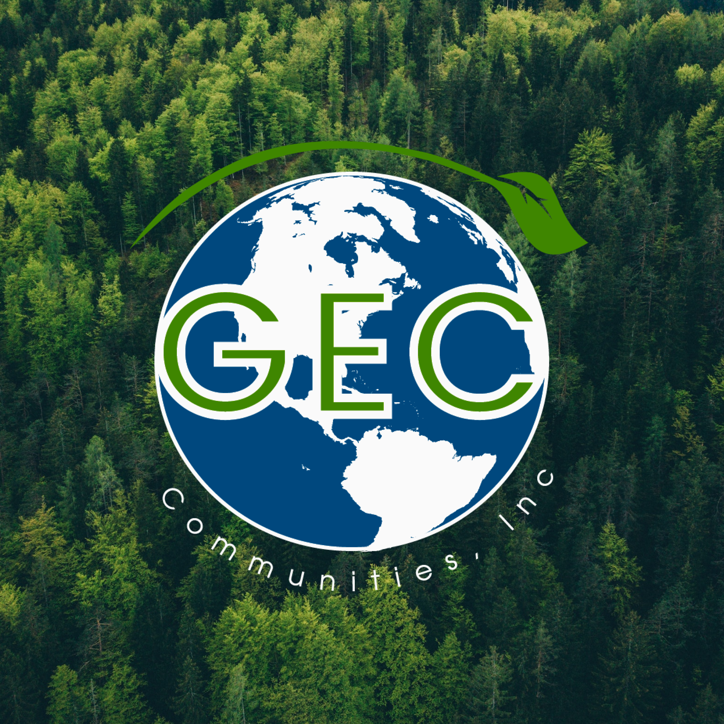
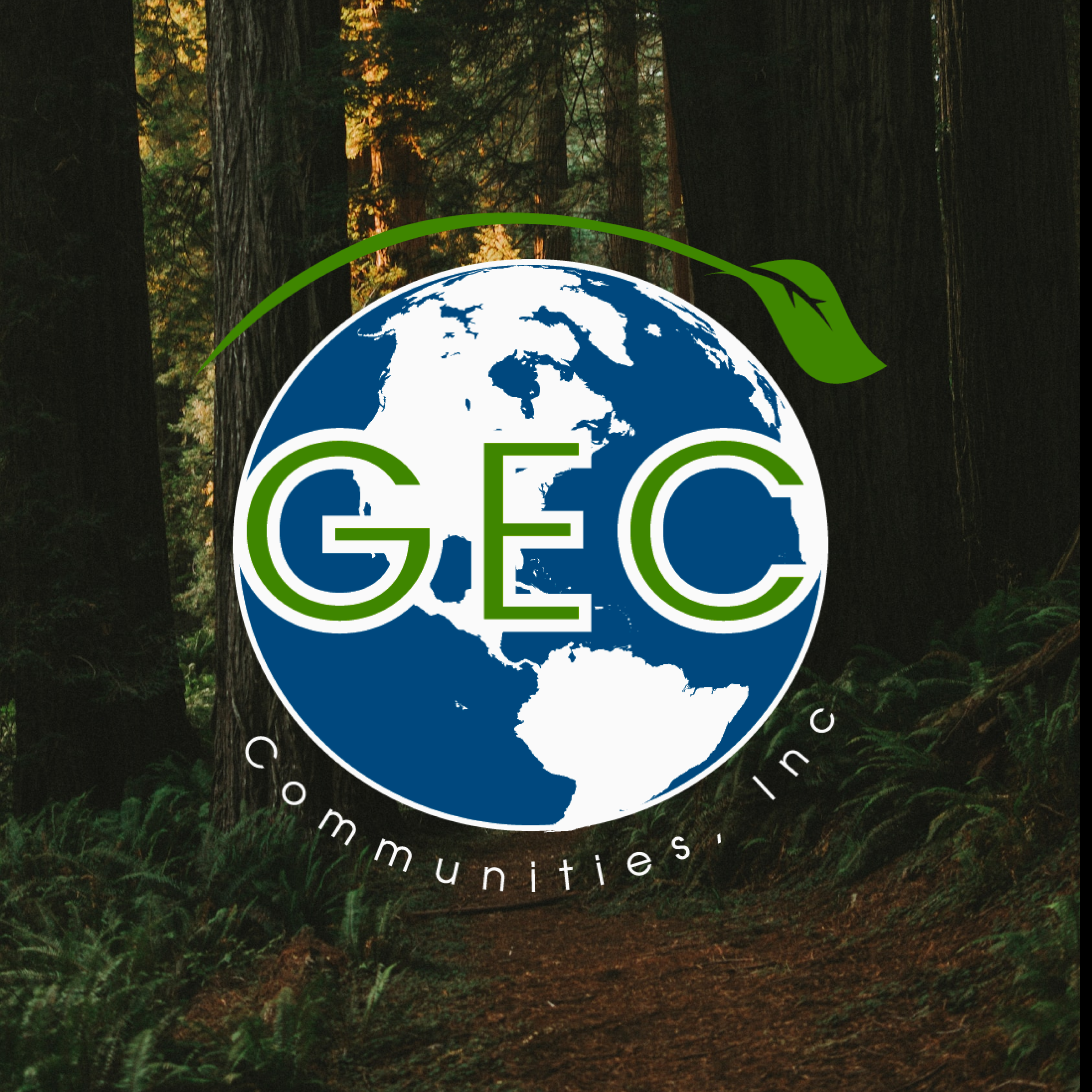
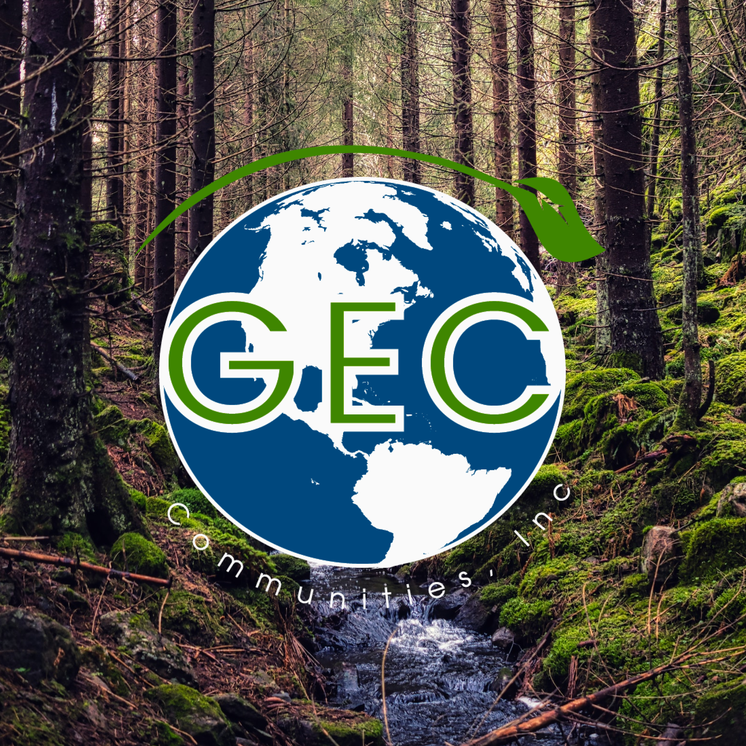
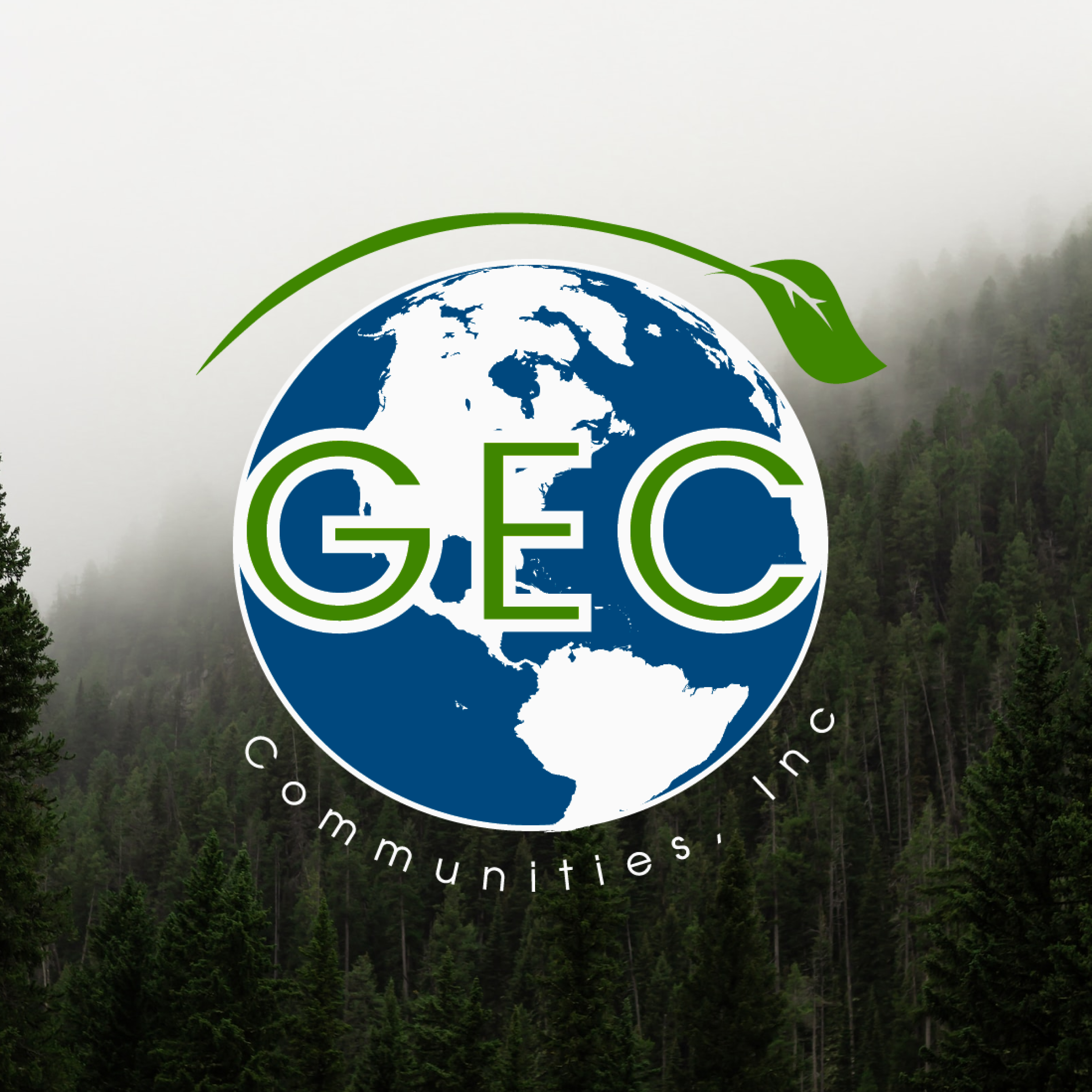
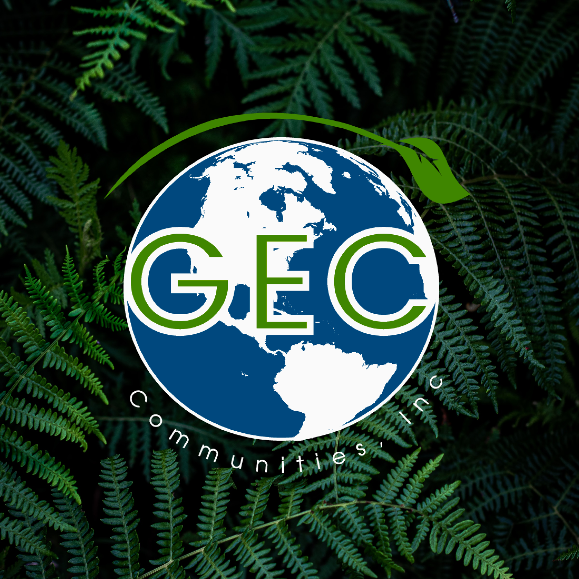
My work with GEC started before the rebrand. Using their original logo, I created a series of six Instagram cover images for their social channels — pairing the existing mark against different nature backdrops: mossy forest floors, foggy mountain pines, fern canopies, and sunlit timber forests. Each image reinforced GEC's rainforest preservation mission through photography alone.
These covers also served as visual assets in pitch deck presentations to investors and partners. I assisted in the design of several of those decks — helping communicate a complex financial and environmental concept in a clear, credible way.
03
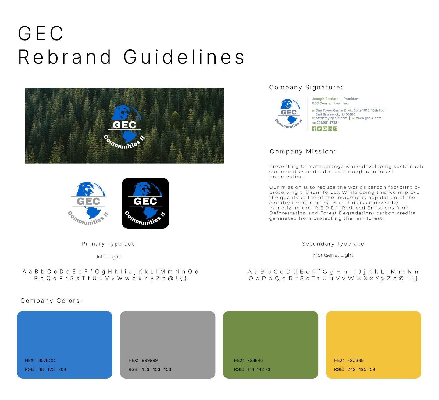
Phase 2 — The Rebrand
The next phase was a full rebrand. GEC's original logo lacked the polish and versatility needed for professional outreach — it was flat, hard to read at small sizes, and didn't translate well to different backgrounds. The updated mark introduced a green leaf sweep around the globe, a cleaner typographic treatment for "GEC Communities II," and a color palette that works across both light and dark contexts.
I produced a full set of rebrand guidelines defining the logo in both color and black versions, the primary typefaces (Inter Light and Montserrat Light), the four brand colors, and a company email signature template.
04
LinkedIn Banner
With the new logo in place I redesigned GEC's LinkedIn banner — giving them a consistent, professional presence on their most important B2B channel. The wide-format composition uses nature photography to immediately communicate the brand's mission before a visitor reads anything.

05
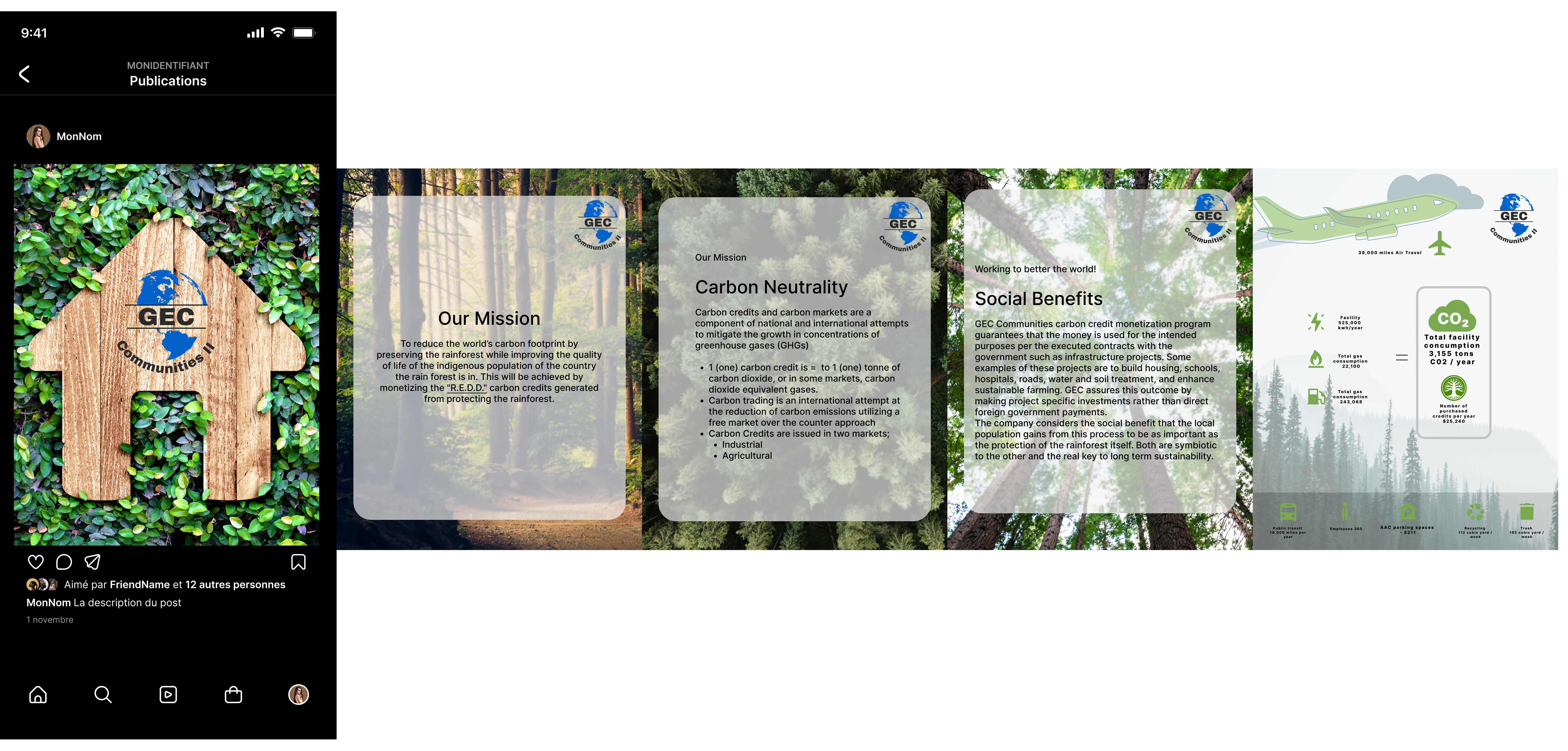
Instagram Carousel
I also designed a multi-slide Instagram carousel to communicate GEC's mission and impact — covering their mission statement, an explanation of carbon neutrality and carbon credits, social benefits to indigenous communities, and a carbon footprint infographic. The cards use a frosted glass overlay on nature photography to keep the earthy aesthetic while making dense information legible and scannable.
06
Phase 3 — Website Redesign
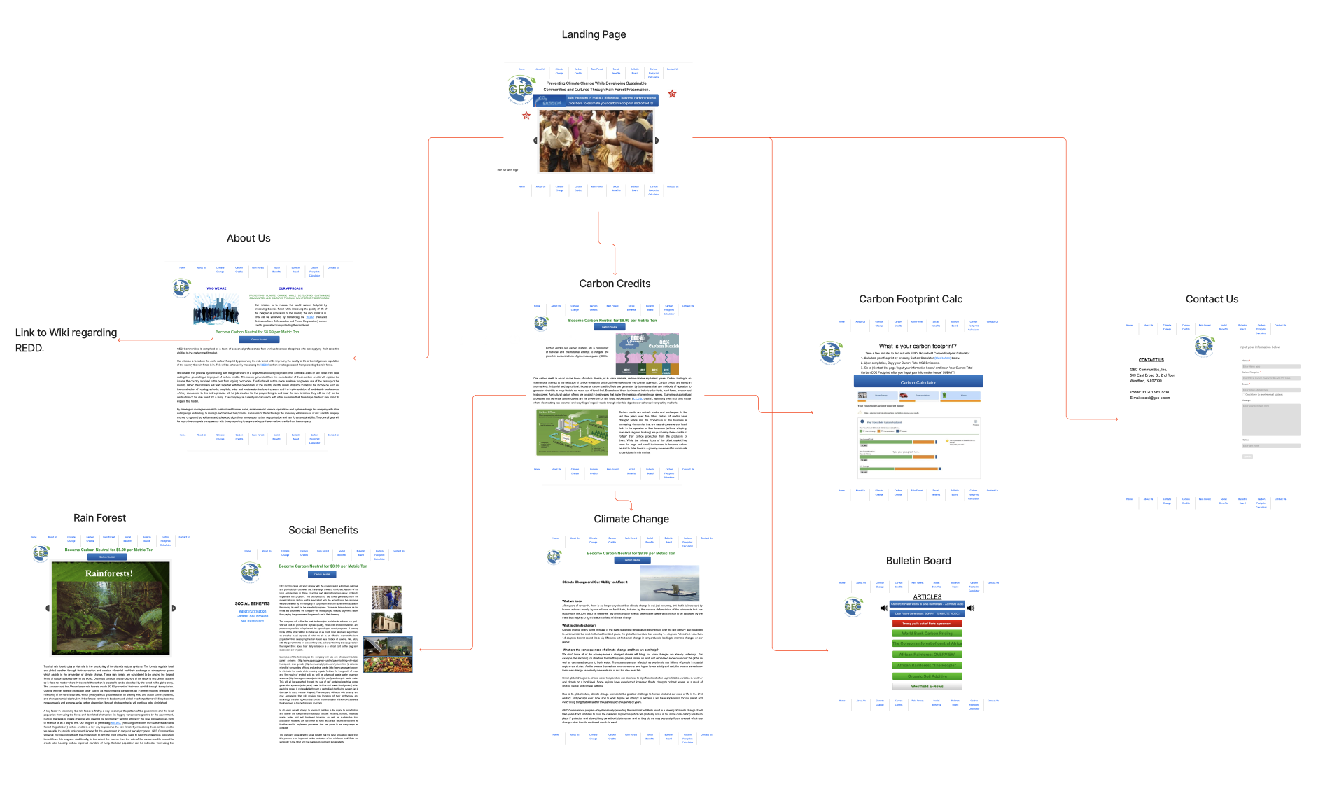
The final phase was a complete website overhaul. GEC's existing site was overly wordy and hard to navigate — key information was buried in dense text with no clear hierarchy, and the structure didn't guide visitors toward understanding what GEC does or why they should care.
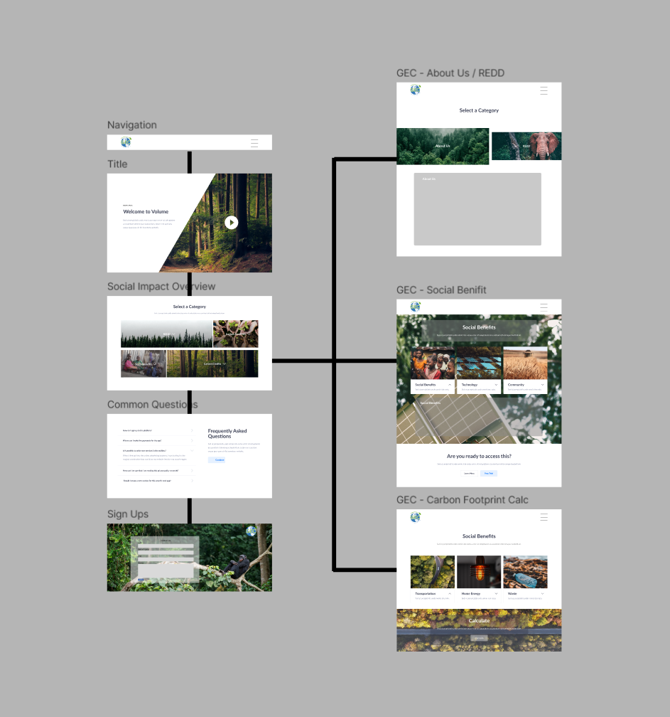
I gathered resources, images, and videos, then built several layout options in Figma with interactive prototypes showing how the navigation and page flow would work. The new structure broke the site into clear, purposeful sections: a hero landing page, About Us / REDD explanation, Carbon Credits, Social Benefits, a Carbon Footprint Calculator, Climate Change education, a Bulletin Board, and Contact.
Once the layout was approved by the lead designer, I built it in Wix Studio. The lead artist then handled final copy tweaks and SEO optimization.
Original Site
New Site Architecture — Figma
07